Layouts
Layouts are the foundation of Email Kit, ensuring harmony across platforms, uniform spacing and consistent positioning of components.

Tables and Divs
Creating HTML emails that are compatible across all the major clients requires stepping back in time to when designers and developers relied on tables for structure. Tables are still the only universally supported method for creating compatible layouts, making them the defacto solution in Email Kit.
But what about divs? Divs can certainly be used, but there are a few trade-offs.
- Some client rendering engines are still not capable of handling divs in a consistent manner.
- For now, you are mostly limited to simple one-column layouts.
Email Kit hasn’t given up on using divs for HTML email development. Although version 1 will utilize tables, efforts are underway to begin testing future compatibility using divs.
Structure
Email Kit utilizes two nested layout tables wrapped inside a body tag which sets the background color and a center tag which centers the email.
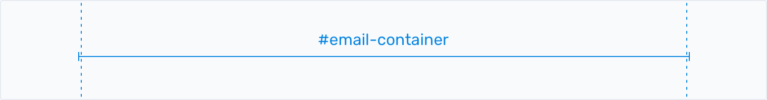
The first table, #email-container, sets the width to 600px.
 The email container is centered by default.
Below is an example of the #email-container table.
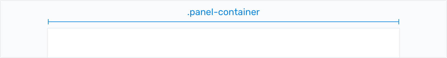
Email Kit uses a default width of 600 pixels. Other common widths are 580 and 640.The second table, .panel-container, creates a panel (great name right?) with a white background. You'll add the majority of your content inside this panel.
 A white background for the panel is recommended.
Below is an example of both the #email-container and .panel-container tables nested together.
The design of the panel-container can be customized in the Styles block.With the base structure in place, you are ready to go. The sections below explain how to utilize the various layouts in Email Kit when adding content.
Spacing
Email Kit's approach includes setting the horizontal spacing (left and right padding) within the layouts and the vertical spacing (top and bottom padding) using spacer rows within your content via the .spacer-* classes. By following this best practice, row-based approach to HTML email development, it allows you to have consistent spacing across each client by default.
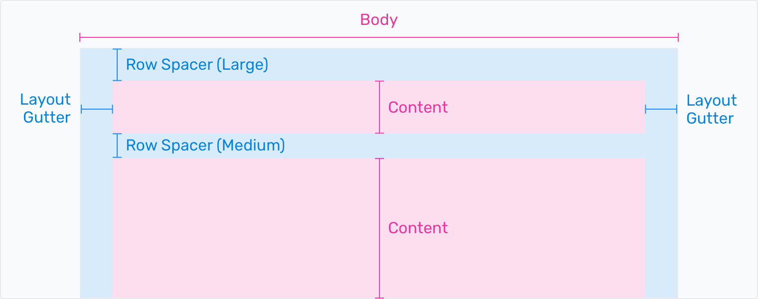 Vertical spacing within your content can range from double extra small (xxs) to double extra large (xxl).
Layout Grid
Most design systems utilize a layout grid to ensure consistency. These frameworks such as Bootstrap and Material, generally use a 4, 8 or 12 column grid. Although it was initially considered to follow this pattern, due to the simpler nature and constraints of email, it was decided in version 1 to define a set of standard layouts for mobile and desktop.
Email Kit has greatly simplified the design and development of your emails with common patterns based on rows, columns and gutters to make content easy to layout and align. Keep reading to see how it all works.
Rows
Table rows <tr> are at the core of keeping layouts and content well structured, visually balanced and consistent across clients. You can think of rows as the containers for columns and gutters. Inside of columns is where your content lives in the form of elements and components.
Email Kit takes a row-based approach to vertically laying out content.Columns
Table columns <td> are where you place your content. When necessary, column widths are set in pixels for desktop and have the option to flex using percentages on mobile. To give you some flexibility with your layouts, you can use the .col-responsive helper classes to determine whether a column should flex on mobile.
Why not use percentages all the time? While you can get the same amount of control using either method, pixels seemed like the better option in order to better understand the true sizing of gutters, columns and content elements.
Column widths are set in pixels.Gutters
Gutters are the spaces between columns giving your content the appropriate spacing. Email Kit contains two types of gutters. The first are layout gutters which are included by default in the .panel-container. The second type are column gutters which are included in the various layouts.
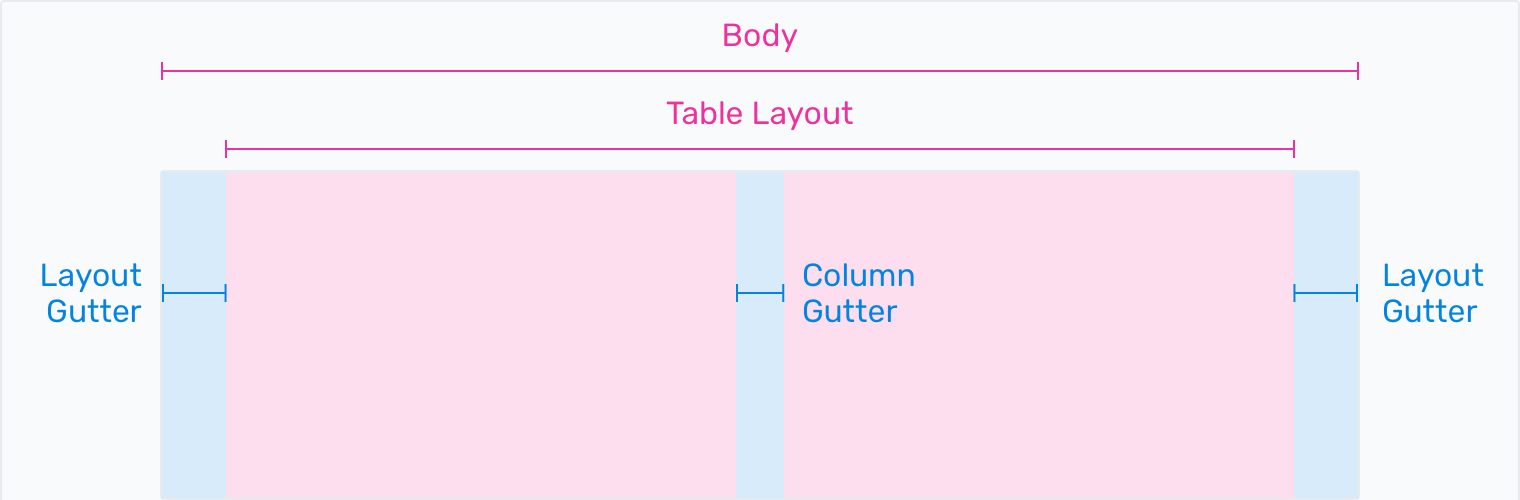 Email Kit contains two types of gutters.
Two Column Example
Copy the code below and paste it into a table within the .panel-body to create an two-column layout in your email.
An example two-column layout in Email Kit.Three Column Example
Copy the code below and paste it into a table within the .panel-body to create a three-column layout in your email.
An example three-column layout in Email Kit.Aside Example
Copy the code below and paste it into a table within the .panel-body to create an aside layout in your email.
An example aside layout in Email Kit.Responsive
With mobile devices accounting for nearly half of all email opens, it’s critical to use layouts that can adapt to your audience. Layouts in Email Kit can react to mobile screen sizes through the use of media queries and special classes set on your columns.
Making a layout mobile-friendly requires the following:
- Add a .column-responsive class to each content column.
- Add a .column-responsive-gutter class to each gutter column.
- Add an additional .column-responsive-last class to the last content column.
This will allow columns to stack when the screen size is under 600px wide.
An example two-column responsive layout in Email Kit.Header, Preheader and Footer
Although the header, preheader and footer of your email are usually part of the base template due to their static nature, Email Kit treats these as components and more information can be found by visiting their pages under the components section.
Best Practices
Follow these best practices when building layouts to create uniformity across devices.
- Tables are your best friend. Use them.
- Always think about your layout and plan your content using a row-based approach.
- Set your email width to around 600px to accommodate most desktop clients. You can always go a little smaller (580) or larger (640) depending on your requirements.
Frequently Asked Questions
Answers to common questions about layouts in Email Kit.
Yes, divs can be used for simpler one-column layouts although you may run into compatibility issues with certain clients. If you a want multi-column layout, it will be best to use tables.
Absolutely. Email Kit even nests tables to create the initial email and panel containers.
